Control Name and Type
Control Name Only
Reduced
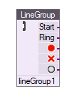
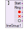

Developers have the ability to change the way that VBVoice controls are displayed on the design page. The default view of the controls shows both the name of the control and the control type.
You can save space on the form by not displaying the control name and the control type name. See the VBVFrame General page to learn how to turn on and off these options.
If you turn off the display of the control name or control type, you can still view the information in a pop-up window that is displayed by hovering the mouse over the control icon.
|
Control Name and Type |
Control Name Only |
Reduced |
|
|
|
|
You can change the color scheme of VBVoice controls by changing the theme setting.
VBVoice 10.2 supports the customization of the parameter:
[LAYOUT]
Theme=0 (or 1~8)
For more details about these parameters, see the [Layout] section in Appendix 1.
Prepared themes are shown below.
Each control color represents its group by function to allow you to view at a glance the types of controls you are using in your project.
|
Theme 0 : Default |
Theme 1 : Colourful-V1 |
|
Theme 2 : Colourful-V2 |
Theme 3 : Green |
|
Theme 4 : Greenish |
Theme 5 : Blue |
|
Theme 6 : Bluish |
Theme 7 : Highlight |
|
Theme 8 : Original |
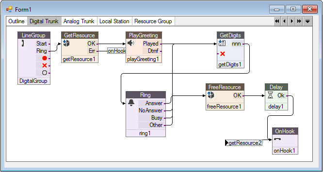
The VBVFrame control has a special mode for viewing the overall connection outline of your system. Each page of a VBVFrame generally displays one part of the whole system. The outline view shows a block for each page in the frame and shows the interconnections between the pages.
Lines are only drawn from left to right: If a page connects to another page that is to the left, the connections are shown by writing the name of control.
You can move the page blocks to show the most logical view of your system. To zoom into a page, double-click the desired page.